Note: This blog post was originally written in Japanese for our Japanese website. We use our machine translation platforms to translate and make automatic corrections, and then partially edit to fit the content in English.
As more companies use translated materials and content for global markets, layout distortions and reduced readability after translation are becoming a common issue. To get full value from a translation, the final stage, which covers not just the content but also its presentation, is crucial.
In this post, we'll look at the role of layout adjustments (DTP), an essential step after translation, and why it matters so much.
The finishing touch
Using a translated document as-is often means text overflows and the page layout falls apart. That’s why layout adjustment (DTP) is an essential step after translation.
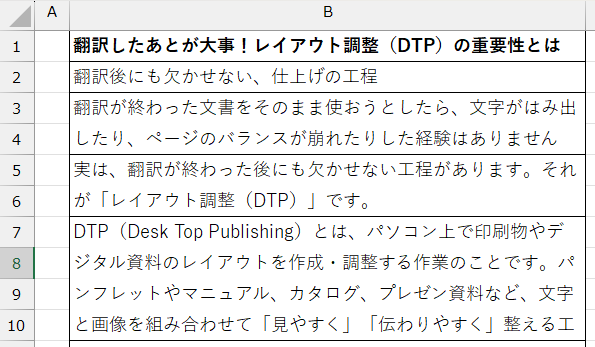 Excel files are especially prone to DTP errors, such as text cut off mid-sentence.
DTP (Desktop Publishing) is the process of creating and adjusting the layout of printed materials and digital documents on a computer. It combines text and images to organize materials such as brochures, manuals, catalogs, and presentation materials so they're easy to read.
It's not just about making things look good. It's also about making sure information comes across accurately. How text is arranged, the line spacing, and the use of margins can all significantly affect the reader's impression and understanding.
The difference between standard DTP and post-translation DTP
Standard DTP generally finalizes a design within a single language. When the target language changes, elements like character length, text direction, fonts, and paragraph formatting change too, so simply dropping translated text into the existing layout will break the whole layout.
A common issue after translation is a change in character count. When the character count increases or decreases, text can extend beyond the margins or create awkward line breaks. Excess white space can throw off the balance of the page.
There are languages with different fonts or character widths, such as Chinese and Korean, and languages that read right to left, such as Arabic and Hebrew, which requires changes to the text direction itself. Post-translation DTP takes these linguistic and cultural differences into account to optimize the visual result.
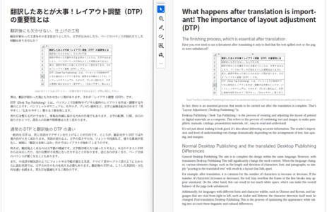
Left: the original draft of this post. Right: the same draft after machine translation.
The layout has changed significantly, using fonts and settings that wouldn't normally appear in standard English documents.
Main tasks involved in post-translation DTP
During post-translation DTP, we fine-tune both visual appeal and readability. The main tasks include:
- Font selection and preventing character corruption: selecting fonts compatible with the target language and adjusting them so characters display correctly
- Adjusting paragraphs, line breaks, and line spacing: adapting the page layout to account for changes in character count after translation
- Revising text in charts and images: replacing any text in illustrations or graphs with the translated version
- Supporting language direction changes: reversing the entire layout for languages read right to left, such as Arabic, and adjusting settings like paragraphs and grids in software such as InDesign to match the target language
- Supporting multiple file formats: adjusting print files such as Word, InDesign, and Illustrator, as well as digital materials such as PowerPoint presentations and video subtitles
Through these processes, post-translation DTP makes sure the translated document reads naturally.
Why post-translation DTP matters
No matter how accurate a translation is, a messy layout or hard-to-read text will significantly hurt the overall impression of the document. In particular, in materials like catalogs and manuals, a disorganized layout can make a product look low-quality or unreliable.
If you skip post-translation DTP, the following issues may occur:
- Garbled characters from unsupported fonts
- Text extending past the borders of the box, or line spacing that's too tight
- Misaligned figures and images that throw off the page layout, sometimes causing figures to disappear entirely
- Awkward line breaks and paragraphs that make the text hard to read
These issues might look minor individually, but together they can hinder the reader's understanding and hurt the brand's image. Post-translation DTP is the final step that prevents these problems and makes sure information comes through with the same quality, regardless of language.
From the field: common examples
For example, when translating a Japanese product catalog into English, increased text volume can make it impossible to keep the original page layout. In these cases, our DTP specialists either adjust fonts and paragraph settings to meet the client's requirements or reposition headings and images to redesign the page.
If text in a chart or figure is embedded as an image, simply laying the translation on top can look unnatural, so the figure is recreated with the translations.
This work requires not just design software expertise but also an understanding of linguistic characteristics. When translators and DTP specialists work together, the result is natural and visually appealing.
Summary
Post-translation DTP isn't just about layout adjustments. It's a crucial step in making sure information comes across accurately and attractively in any language. By carefully adjusting fonts, line breaks, charts, tables, and text direction, we create materials readers can understand effortlessly.
Just like translation quality, DTP quality is a key factor in building trust in a company and its products.
Kawamura International's services
Translation can change factors like character count and font size. At Kawamura International, we provide comprehensive support across the entire process, from translation to post-translation layout adjustments, printing, and even inserting subtitles into video, for all types of documents. If you’re dealing with layout issues after translation, or want to get it right from the start, reach out. We’d love to help.
