Note: This blog post was originally written in Japanese for our Japanese website. We used our machine translation platforms to translate it and post-edit the content in English. The original Japanese post can be found here.
This is a two-part post — in the previous post (part 1), we shared some basic layout tips common for any language that could be used right away, using Microsoft Word as an example. In this post (part 2), we’ll talk about common layout mistakes we see during layout edits performed after translation work as well as layout differences in English and Japanese.
Common layout mistakes
Using line breaks instead of page breaks
We very often see documents in which page breaks are made using line breaks. This is not recommended since any change in the content can also change which text appears on which page. So, always use page breaks! They can be added in several ways.
- The easiest way? Press Ctrl + Enter.
- Access the [Layout] tab and press [Breaks] in [Page Setup], and select [Page] under [Page Breaks]. You could also select [Next Page] under [Section Breaks] — this is great to use when you’re changing layout between sections such as a cover page, TOC, and body text.
- In the [Home] tab, click the bottom-right arrow in the [Paragraph] panel. In the [Paragraph] settings window, choose the [Line and Page Breaks] tab, then [Page break before] under [Pagination]. The text selected will automatically start on a new page. We often see this registered to header For example, [Heading 1] with the [Page break before] setting will make sure that [Heading 1] always starts on a new page.
Inserting images in front or behind text
When you insert an image in Word, you can control its appearance (color, border, effects, etc.), position, and whether text wraps around it. After copying and pasting an image or inserting it from the [Insert] tab, select the image and left-click to adjust settings (the [Picture Format] tab appears and you can also change the settings there). As a rule of thumb, set [Position] to have the image either in line or with text wrapping, then [Wrap Text] to [Move with Text]. These settings ensure that the image will move together with any changes made in the text.
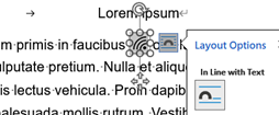
*Example of an icon in line with text.
Now, let’s talk about using icons inside text.
Oh no! Don’t do this:
Creating a blank space using spaces or tabs and then placing the icon on top of it with the [In Front of Text] setting. |
With [In Front of Text], the icon may end up in an inappropriate position when the text changes. This happens often when text is translated or updated. When such documents contain hundreds of pages, there is a risk that misplaced icons are overlooked. Furthermore, after translation, it can be difficult to know which icon goes where. If you haven’t already, please try inserting the icon in line with text.
How about using images as backgrounds?
If you want to use an image as a background, you can set [Wrap Text] to [Behind Text]. If you want to repeat the same image on several pages, try adding the image to the header or footer — the same image will be repeated for every page in the same section.
Using line breaks, space, and tabs to add spacing
Rather than inserting line breaks between paragraphs to add spacing, it is recommended that you add spacing before or after the paragraph in the [Paragraph] settings. Unnecessary line breaks can sometimes hinder translation or even cause mistranslations.
We often see spaces and tabs used to add spacing in text — once again, we recommend getting used to changing [Paragraph] settings. This will make your document look better as well as improve the productivity of your translation work. Instead of using spaces to add indents to your text, set [Indentation] to [First Line]. And instead of using several tabs in a row, use only one tab, select the paragraphs in question, and then configure where you want to line your text up using the Ruler above your document (or access [Tabs] from the [Paragraph] settings window).
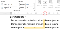
*The three lines below “Lorem Ipsum:” have the left indent set at 0.5 ch (characters) and left tab at 16 ch. Notice how only one tab is used for all three lines.
English and Japanese layout differences
You might be wondering if a document translated from English to Japanese (or another language) needs layout editing. Maybe not if it’s an internal document. But it would be recommended if it’s something for your clients and users. Here are some of the differences between English and Japanese layouts, and why documents need editing after translation.
- First and last character settings (禁則, kinsoku): Found under [Paragraph] > [Asian Typography] > [Options], select [Strict]. Without this setting, Japanese and other East Asian languages end up with line breaks in the wrong place.
- Document/text language: If language is not configured correctly, the above settings aren’t applied and the Word’s Spelling and Grammar checking function won’t work properly.
- Font type: Asian and Latin text use different fonts. Without changing font settings, a great document can easily end up being a catastrophe.
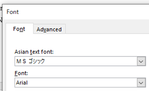
*Remember to use the same sans or sans-serif type fonts for consistency between languages.
- The size of letters (not just fullwidth and halfwidth) vary depending on the font and language. The length of the text also changes after translation. If you didn’t heed our advice to use page breaks instead of line breaks to break up pages, well, this is another way your document could end up being a catastrophe.
Summary
In this two-part post (if interested, check out part 1), we covered basic layout settings using Microsoft Word as an example, but similar settings can be made in other software as well. Although the initial setup might take some time, it will help reduce the time it takes to create your documents and make them easier to read. If you want more detailed explanations, InDesign advice, or any other kind of information regarding layout work with translated documents, please feel free to reach out to us.